The Graphics in the post were provided to me for free, and I was asked to provide a testimonial that could be used about my experience and I decided to do a full fledged review of them. All thoughts opinions ideas that are stated are honest and my own. Your experiences and thoughts ,etc my vary
About two months ago I met up with an AWESOME gal named Sarah who had done some design work that I thought was quite awesome and she was kind enough to offer to make me a graphic for Autumn-Rain (and later on Southern-Belle, I’ll get there) for totally free- she just wanted to know if she could put it on her portfolio (OF COURSE!) and me to write a brief testimonial that she could use as well.I am SO very happy with her work I decided to write out an full fledged review for her and just let her link back to her or take a portion of it for her blog- just a way to show how much I totally appreciated her work! 🙂 After all she did make awesome graphics for two of my blogs in just a matter of days!
A little bit about Sarah & Dirty Fish Designs:
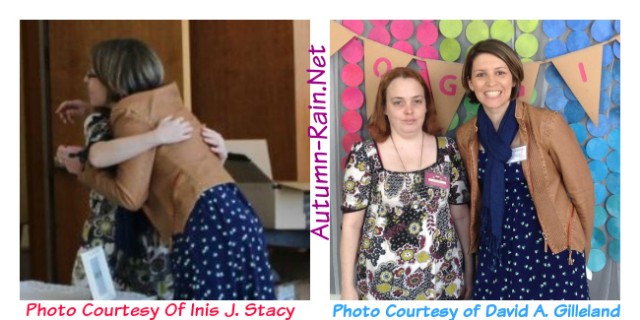
Sarah owns two awesome blogs Scissor Saving Sarah and The Hot Mess Kitchen and has recently started with her own design site Dirty Fish Designs which is a totally awesome and memorable name in my opinion! Sarah lives at the coast of N.C. so I am sure that the name has to do with that aspect of her life! I find it to be very fitting 🙂 I have actually met Sarah in person and I really enjoyed that- here is a picture of us when we first met that my mom just happened to stumble by and take at that exact moment (seriously how cool was that?) there is also a picture that we posed for that David took of us too 🙂
First Up, Let’s Freshen Up Autumn-Rain for the first time in YEARS!
I had been wanting to have Autumn-Rain redone for QUITE a while. I had the same basic look for quite a while and had been using the theme I was using for a REALLY long time. I wasn’t so much worried about the actual theme because those are easier to change when you are someone like myself 🙂 I had started thinking about what I really wanted in a graphic for Autumn-Rain to start with, because it is my primary project and it had the more need for a design at the time- so I figured when I found someone who would make me a graphic for it I would already know what I wanted in a round about way!
I had it narrowed down to something with leaves, maybe a cloud, an umbrella, and some sort of gal. I kind of got to thinking about it and I thought hmm.. this is kind of like the “sun bonnet sue” things that my crafty mother makes.. Every time I would be at her house and see something she had made with that design I was like yeah- that would be a neat thing to do for the blog if i ever find someone who wants to help me out.
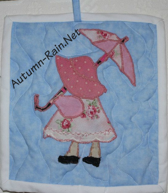
When I first asked sarah about doing a graphic I told her that I wanted something with Leaves, Rain and a Sunbonnet sue type of girl. I didn’t know if she knew what I meant when I said sun bonnet sue but I actually know that she looked it up and I sent her this picture of one of the mug rugs/ pot holders that my mom made that had sun bonnet sue on it
Sarah was very easy to get into contact with on Facebook Chat, and she was really prompt to answer questions and consider every idea that I threw at her(in relation to both sets of graphics that she made to me) . I told her that originally I wanted Pink and green and Blue and Purple in my graphics. I kind of had an idea of which colors should go where , but we did end up leaving out the purple and we ended up opting for fall colored leaves! I think my original thought was blue rain drops, pink on the girls dress, purple umbrella and green leaves.
I had fun picking out the leaves and having them be fall leaves and not just your random flower leaf that was really important to me especially with trying to incorporate in the “Autumn” part with Autumn-Rain I love how the leaves and the rain kind of say that speak to the sites name.
Sarah actually digitized my moms original work and that is how we went about deciding the rest of the things like color and leaf type and whatnot! Here is what the digitized version of the sunbonnet sue looked like when she was through with it:
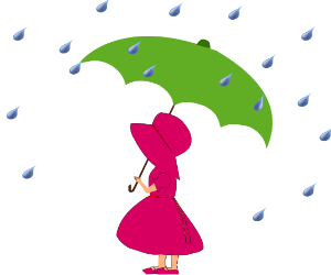 (This image was created by Sarah of Dirty fish designs and is based on a sun bonnet sue creation by Inis J. Stacy, for use on Autumn-Rain.net graphics by Nichole and can not be used without further permission from the mentioned parties)
I thought it was simply stunning and Sarah included me in every aspect of the design asking me what I thought of various color schemes that she found that matched what I had specified, which was really fun by the way! She also asked me what I thought of different things in relation to the girl and umbrella and things along the way too. She went above and beyond to make this graphic exactly what I wanted.
Of course the final graphics can be seen at the top of the page, and she even made me a facebook banner but.. I did want to include it inside the actual review as well 🙂 Oh and before I forgot the turn around time on this was just a mater of days, I think the only thing that took a little while was the actual font, because it was purchased.

In all I am very impressed with this graphic (as well as the other one) and I was really happy to have what we bloggers call “branding” I like how it is a more grown up sort of look and it doesn’t look babyish. I know that I have honestly had better luck with getting reviews and such that I had pitched before since I redesigned. I think it helps things flow more easy, it isn’t to busy and it is easy on the eyes. I also like the story behind it and people think it is REALLY special because it was made by a friend and based on my moms work!I was more than happy when designing my new blogging cards to put this on the back. This is when I decided that should decided that if I could get her to do one for my other blog it would be awesome that way it would all jive together, so to speak.. plus there is nothing like new graphics and a new look to make me be more inspired for blogging (or one that I REALLY like)!
Some Graphic Help for my other blog- Southern-Belle
I had not really thought about WHAT to do for a redo of Southern-Belle .. Ya’ll know that honestly I just jumped on that domain because I liked the domain name and didn’t want to let it go to waste since it was available. I did do a little bit of work there but the I let if fall behind. Since I have decided to use it for VA services/Local Reviews/Ramblings/Faith based stuff I figured that to have a more attractive design there would be awesome as well and I of course wanted Sarah to make it since she did such a great job on Autumn-Rain’s graphic 🙂
At first I just told sarah something southern and something girly and of course pink and green lol. Then… I got to thinking back to my other basis of my graphics- my crafty mom! She had made a pot holder with this gal that kind of reminded me of Scarlet from gone with the wind- and to me I was like ooh how southern. So I sent sarah a picture of the inspiration- this picture below shows the inspiration and also a few things for me that my mom made me to match!
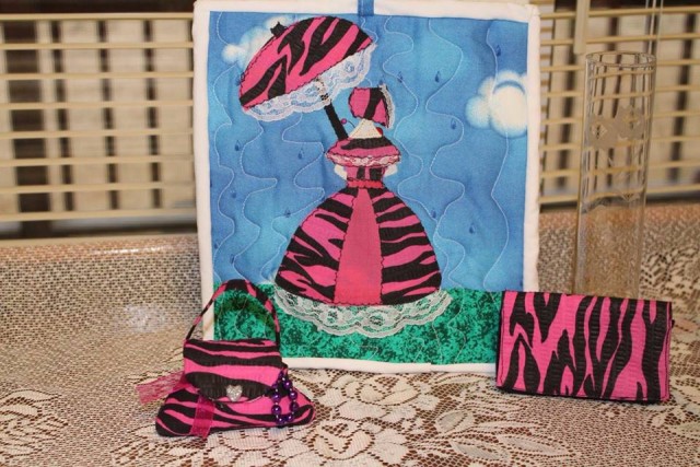
Sarah said it reminded her of the Azalea Festival that is held in Wilmington- the gals with the fancy southern dresses and what not and we were on the right track! We ended up just going with the original color scheme that my mom had and totally scratched the greens/purples:
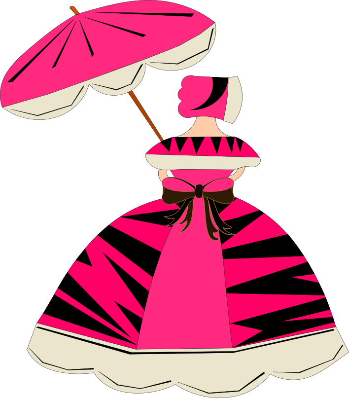 (This image was created by Sarah of Dirty fish designs and is based on a creation by Inis J. Stacy, for use on Southern-Belle.net graphics by Nichole and can not be used without further permission from the mentioned parties)
I think that my southern belle gal is ABSOLUTELY PERFECT. My mom REALLY liked this one and she has been complimented TONS on how well she matches my moms original too! She has really inspired me to work on my new blog even though I have been so busy I haven’t had the chance to work on there as much as I have wanted to just yet (hello AR keeps me busy and then rebooting BE with a new name and …life in general) but it will happen 🙂
In case you are wondering what the completed graphic looked like :
Summing It All Up:
I LOVE my Awesome graphics that Sarah from Dirty Fish Designs made for my two blogs! I love how they inspire me, how they make the blogs look and how easy she was to work with. I love how efficent she was and how I was included in the process and got to choose every thing along the way. I love how detailed she was and how she took every thing I said into consideration. I love how it felt like she knew me for years and gave me exactly what I wanted and how she made me feel like my projects were important to her. I love how it felt like we connected talking about various things related to the designs and whatnot too. I have never really been involved in a design process and I felt like i might be too picky to work with , but she didn’t make me feel that way at all.
If you are looking for an awesome design you should def. check her out 🙂 I hope that we can remain friends and work together in the future and heck maybe our paths might cross again! Now I just need to make a signature, a button and a watermark with my gals for each site to complete the look. If you couldn’t tell I don’t have enough nice things to say about my experience with her!

